2007 Meermanno Museum The Hague
The master printer Aldus Manutius
In 1464, the art of printing was introduced in Italy. Five years later the first printers settled in Venice. The commercial metropolis soon became a center of printing and publishing that dwarfed the other Italian cities. However, when the schoolmaster and scholar Aldus Manutius (1449-1515) started his printing business there, he introduced something new. He focused on publishing important ancient writers in the original languages. This made him the first to work on building a Greek fund.
Thus introduced innovations such as the editions of classical writers in small format and the use of the economical italic type. Erasmus, for example, was happy to make use of his services, because his publications were excellently prepared in appearance and content. In the motto of his printing brand ‘Festina Lente’ (‘Proceed, but do it slowly’) zeal was linked to policy.
Compared to the other books that Aldus edited, Aldus wrote, he discussed the work in detail and the Hypnerotomachia Polihili is an exception in almost every respect. This applies to the subject, the literary form, the language, the style and the illustrations. The work was edited by Aldus, but not published by him. He printed it on behalf of Leonardo Crasso, who financed the work.
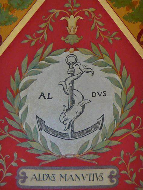
Festina Lente
The well-known printer’s mark of Aldus Manutius consists of an anchor with a dolphin. The representation is taken from an ancient Roman coin. In Aldus the image first appears in the Hypnerotomachia Polihili of 1499 and is there interpreted as a rebus that refers to the ancient saying ‘Festina Lente’ (‘Proceed, but do so slowly’). From 1501 you used the anchor with the dolphin as a printer’s mark, sometimes sealed from the Latin motto. In the essay on ‘Festina Lenten’ that Erasmus wrote in 1508 in the printing house of Aldus, he discussed the work and printer’s mark of his host in detail.
Greek classical works
Before Aldus established himself as a printer in Venice, Greek works had already appeared in print elsewhere in Italy. However, their numbers were limited and the print runs small. Thus the ambition was to publish the important Greek writers of antiquity in the original language, on a commercial basis, carefully edited and typographically arranged. These editions, partly edited and corrected by Himself, initially appeared in the usual folio format. However, when sales of these works proved more difficult than expected, he switched to publishing Greek and Latin works in the more manageable octavo format. The use of the ‘pocket’ format for text editions was widely adopted.
Books for Education
Publication of the important writers of antiquity in the original languages, Greek, Latin (and Hebrew), was not sufficient. It was also necessary to spread and improve the knowledge of those languages. With this in mind, Aldus published grammars, dictionaries and thesauri. As a former teacher, he was focused on the purity of the language and its grammatically correct use.
Latin classical works
The Latin works that Aldus published were largely published in a small format and were set in the economical italic script that he had specially designed. The use of this font made it possible to place many characters on one line. This way he could also fit a very long Latin verse in one line.
Works in the vernacular and works by contemporaries
In addition to works by classical Greek and Latin authors, Aldus also published writings by contemporaries who wrote in Latin. They are usually learned treatises in the humanist tradition, sometimes they are poetry. Only a small number of Italian works were published by him, of which Dante’s Divína Commedia and the Hypnerotomachia Poliphili are the most important.
The Venetian printing press in the fifteenth century
While cities such as Florence and Rome were important cultural centers at the end of the fifteenth century, Venice was primarily a trading city. The first printers to settle there were Germans, who were soon followed by the French. The graphic industry flourished there. She was focused on export and focused on producing mainstream titles in large editions. Lacking the cultural and financial patronage that was characteristic of the other cities, Venetian printers followed the beaten path in choosing their titles. For example, they printed collections of secular and canon law, liturgical books, theological works, Bibles and Latin classics.
They did, however, focus on technical innovations. The undisputed highlight of this development was the work of the French printer Nicolas Jenson (c. 1420-1480), whose typefaces served as models for many later typeface designs. The art of making woodcuts also reached great heights in Venice.
When Aldus settled in Venice, he wanted to use the existing commercial and technical infrastructure to build a scientific fund, mainly Greek. He only partially succeeded; but his attempt was exemplary and original.
The De Spira brothers
The first printer to settle in Venice was the German Johannes de Spira, or Johann from Spiers. He started his business in 1469, five years after the first book was printed in Italy in the Rome area. Within a year he received assistance from his brother Vindelinus (Wendelin), who continued the company after Johannes’ premature death until 1477.
Their publications consisted mainly of works by classical and ancient Christian writers. For this they used the Roman language common in Italy.
Nicolas Jenson
The Frenchman Nicolas Jenson worked in Venice from 1470 to 1481. He brought his company to great prosperity, both technically and in business terms. The Roman that he used for his editions of classical and ancient Christian writers is still considered to be the most beautiful ever carved.
Overproduction led to a crisis in the book industry in the mid-1570s. This is reflected in the choice of titles that the printers subsequently produced. Jenson was also forced to switch from classical writers to titles with guaranteed sales, such as Bibles, legal manuals and theological works. When choosing the font, he followed the conventions: the Roman for classical texts, the Gothic script for the Bible and for theological, philosophical and legal works.
Other printers from the 1470s
The use of printing soon became more general. In this display case four very different forms of printing that were created in the 1570s are brought together: a pamphlet-like poem in which the Christian princes are called to fight the Turks, a Latin collection of sermons about the fear of divine judgment, a monumental edition of the Latin epic poet Ovid, and finally a school edition of the Latin comedian Terentius.
Printers of the eighties and nineties
In the early days of printing, a book was printed in such a way that the entire edition of a section went through the press at once. However, the finishing of the collected copies of a book (applying initials, Lombards, headings, chapter numbers, music notation, etc.) was done individually, by hand and therefore often in different ways. Over time, printers tried to implement more and more parts of the finishing typographically. This meant that the differences between the printed book and the handwriting became greater and greater.
Prints from 1499 to 1811 in Dutch possession
The first Italian edition of the Hypnerotomachia appeared in 1499. A second followed after the death of Aldus among his heirs in 1545. Four French editions appeared between 1546 and 1600 and an English edition appeared in 1592. Previously, the work was mainly known in Western Europe thanks to the French versions. William of Orange owned one from 1554, which he had bound in Paris and fitted with his coat of arms. The French version also appears in the library of Constantijn Huygens, who is said to have been influenced by it when designing the garden of his country house Hofwyck.
Een exemplaar van de eerste druk kwam niet lang voor 1648 in de stadsbibliotheek van Amsterdam, terwijl een ander exemplaar, dat zich nu in de Bibliotheca Thysiana te Leiden bevindt, in 1618 door een Engelsman in Den Haag werd gekocht. Pas in de achttiende eeuw komt de eerste druk regelmatig in Nederlandse particuliere bibliotheken voor. Bij de voorbereiding van de tentoonstelling kon worden vastgesteld dat het exemplaar van de eerste druk dat zich nu in de Bibliotheca Philosophica Hermetica bevindt, afkomstig is uit de bibliotheek van de Haarlemse drukker Johannes Enschedé (1708- 1780).
In de tentoonstelling in het Meermanno bevinden zich alle vroege exemplaren van de Hypnerotomachia die zich nu in Nederlandse publieke bibliotheken bevinden, aangevuld met exemplaren uit particulier bezit. De verreweg grootste verzameling is die van de Amsterdamse Bibliotheca Philosophica Hermetica. De aanwezigheid van al deze exemplaren maakt het mogelijk enkele aspecten van het verzamelen van de Hypnerotomachia in Nederland te belichten en de verschillende drukken te vergelijken.
De Hypnerotomachia in de drukkerij van Aldus
Van de eerste druk van de Hypnerotomachia zijn relatief veel exemplaren bewaard gebleven. In publieke verzamelingen over de hele wereld bevinden zich ca. 230 exemplaren. Wanneer men de exemplaren in particulier bezit erbij telt, komt men op ca. 300 stuks. Dat grote aantal wijst erop dat het boek, hoewel het aanvankelijk niet goed verkocht, na enige tijd een echt verzamelobject werd. Daarop wijst ook de tweede druk die de erven van Aldus Manutius in 1545 uitbrachten. De universiteitbibliotheek van Amsterdam herbergt een eerste druk die tussen 1622 en 1648 verworven werd. Daarmee is dit exemplaar langer in een Nederlandse publieke collectie dan enig ander.
Overeenkomst en verschil
Een jaar na de tweede Italiaanse druk verscheen de eerste Franse vertaling van de Hypnerotomachia. Tussen 1546 en 1600 verscheen het werk viermaal in het Frans. Het is vooral in deze versie dat het boek zijn grote bekendheid in West-Europa kreeg. De vormgeving van de Franse edities sloot aan bij de veranderde typografische opvattingen.Voor de Franse uitgave werden sommige illustraties aangepast.
De aanstootgevende man
In de Hypnerotomachia komen afbeeldingen voor die door sommige lezers als aanstootgevend werden ervaren. Voorbeelden zijn de triomfwagen met Leda en de zwaan, het beeld van Priapus in vol ornaat en de fallische Hermes. In diverse exemplaren zijn sporen van beschadigíng bíj deze houtsneden te vinden. Van het stukje papier waarmee de aanstootgevende lichaamsdelen in het verleden werden bedekt, is de lijmvlek soms nog het enige spoor.
De Hypnerotomachia als bron van verborgen wijsheden.
De Franse druk van 1600 vormt een voorlopig sluitstuk in de rolverandering van de Hypnerotomachia. Wat eens een speels droomboek was met talrijke verwijzingen
Naar filosofie, architectuur en erotiek, speelt nu de rol van handboek. Het is een boek met verborgen wijsheden geworden, die schuilgaan onder de vermomming van een liefdesverhaal. Tekst en illustratie van het titelblad benadrukken die invalshoek, terwijl de bewerker, om niets aan het toeval over te laten, ook nog een uitvoerige uitleg geeft van de alchemistische voorstelling op het titelblad. Een alfabetisch register helpt bij het interpreteren en het interpreteren van de onderwerpen.
De Hypnerotomachia als tekst voor bibliofiele drukkers
De drukkers die gedurende de tweede helft van de achttiende eeuw in Engeland, Frankrijk en Italië het classicistische typografische ideaal propageerden, kozen klassieke teksten om hun opvattingen te demonstreren. Dat konden werken van beroemde schrijvers uit de oudheid zijn of van vermaarde auteurs uit meer recente eeuwen. Twee meesterdrukkers, Didot in Parijs en Bodoni in Parma, beproefden hun krachten op het werk dat wel het meest bibliofiele boek uit de geschiedenis genoemd kan worden. Wonderlijk voor ons, maar geheel in de lijn van hun strenge opvattingen, lieten zij in hun versie van de Hypnerotomachia de illustraties geheel achterwege.
De Hypnerotomachia Poliphili Het Meermanno-exemplaar ontvouwd
De Hypnerotomachia Poliphili is vooral een gewild boek vanwege de illustraties en de bijzondere lay-out. De naam van de kunstenaar die de houtsneden vervaardigde, is niet bekend. In vroeger eeuwen schreef men ze aan Rafaël toe, maar volgens sommige moderne onderzoekers was Benedetto Bordone de maker. De fraaie letter en de bijzondere lay-out vallen direct op. De houtsneden zijn kunstig in de tekst gepast, en overal is een evenwichtige en sierlijke opmaak nagestreefd van alle tegenover elkaar liggend bladzijden.
Museum Meermanno-Westreenianum bezit een exemplaar van de Hypnerotomachia Poliphili dat aan het begin van de achttiende eeuw voor de tweede keer werd gebonden. Niet lang geleden bleek dat het boek opnieuw moet worden genaaid. Maar om dat te kunnen doen, moest het eerst uit elkaar worden genomen. Dat bood een unieke gelegenheid om de rijkdom aan typografische vormen en fraaie houtsneden breeduit voor het voetlicht te brengen.